The Mix Archives
The brief
You play as Sarah. You browse articles from a mix of credible and not-so-credible sources, share the ones that catch your eye, and a community builds up around you. As you share more, the recommendations drift, the community drifts, and eventually you look up and everything is different. The Mix Archives is a game about how the ordinary act of sharing a link slowly reshapes the world around the sharer.
The work
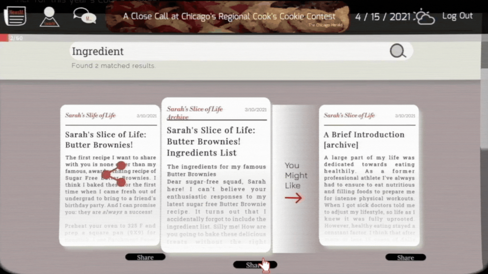
Every article lives on its own page, laid out like a newspaper. Different outlets get different paper styles, distinct colours, typography, and tone, so the player can read where a piece is coming from before they read the piece itself. Breaking News pieces are crucial game moments the player cannot miss.

The Mix Archives is the player’s own page on the network. Every article they share lands here, and a community accumulates around it. As the shared content drifts, the community drifts alongside.
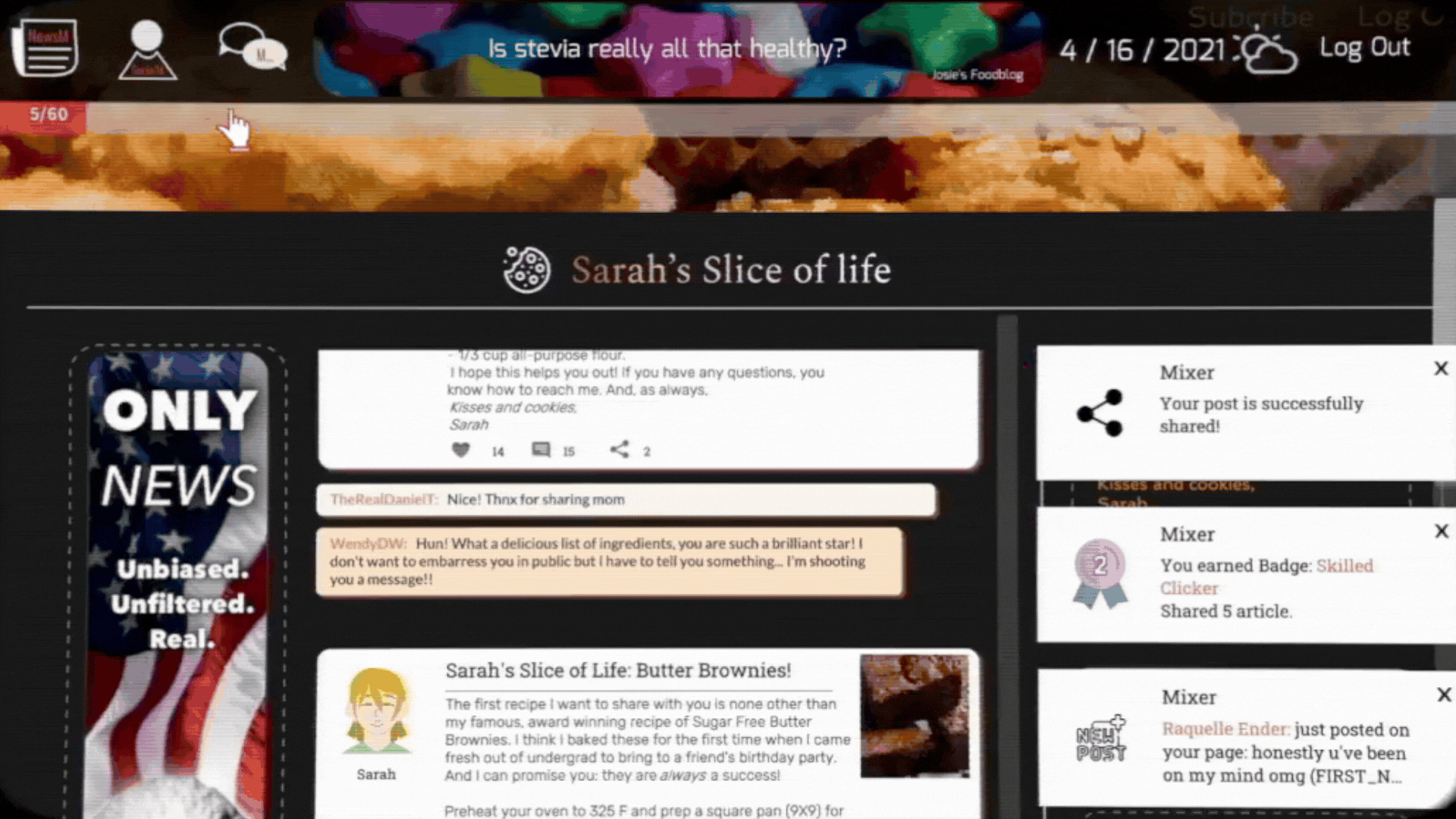
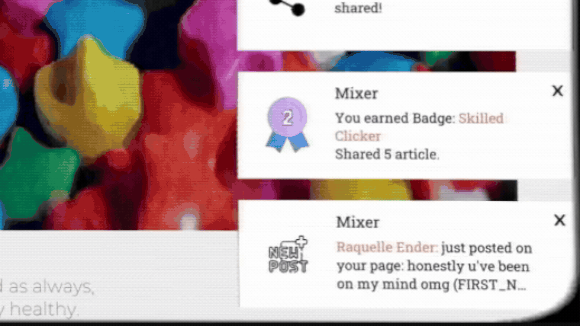
Notifications slide in from the sides, the dialog plays at its own pace, with a fast-forward button if the player wants to push through faster. Notifications popup to show new comments, achievements and progress.
Credits
Team
Nyusha Iampolski
Jet Vellinga
Chros Wang
Swathi Sambasivam
Tools
Unity · C#
LeanTween
Figma · Photoshop
Recognition
NYU Game Center · MFA project